Better Bet

Brief
BetterBet was my final project at Dev Bootcamp, I was assigned to a 5 people (including me) team and we had five days to make a complete web app. The app was a goal tracker with a social network aspect, it let you bet real money against friends on you completing a goal in a given time.
Tech Stack
It was Rails and Postgres in the backend, Sass and Javascript in the front end. Stripe and Facebook APIs were used too.
Team Role
My main role here was being the front end guy, we met at first and decided on features, MVP and who was going to handle each feature, we had 4 stand ups a day, and worked really long hours to get this done.
Limitations
I was familiar with the Neat framework from Thoughbot, I love this framework because it is very simple and flexible, and keeps the HTML and CSS free of presentation class names. It also allows you to prototype and try ideas really fast, and takes care of a lot of browser render differences. So, having just 5 days to complete the project, Neat was the way to go.
Process
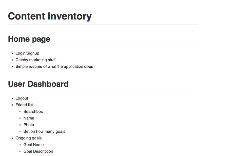
For the styling side, we decided to go mobile first, the problem was that the app had a lot of content to show on a small screen. So I compiled a content inventory of all the content we needed to show, and under which section it should appear.

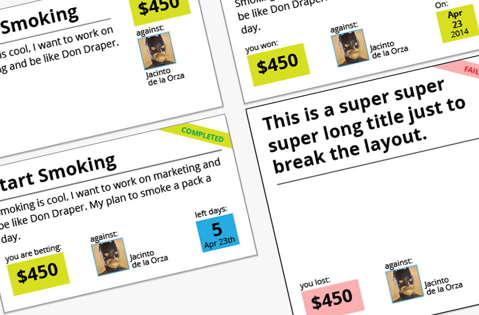
Then looking at that list I tried to figure how each piece related to the others and use that to create modules of content that we could reuse on several pages. We were using Rails so taking advantage of partials was the right thing to do.
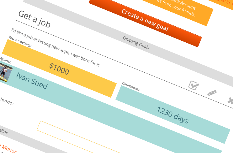
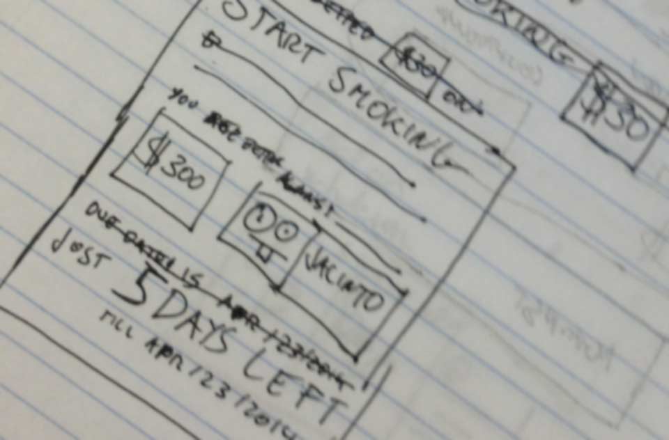
I created a basic wireframe in plain CSS to have an idea of how much screen space each module was going to take. With that knowledge I created sketches of actual modules and played with layout, colour and typography in Illustrator.

Once I got an idea of where I was going I started coding the HTML and CSS, actually I used SASS which made my life a lot easier.

Crisis
Two days from our presentation and crisis showed up, I was sited next to Brittany Mazza, she was writing the tests and I was doing the styling and we were going crazy. We had lots of different views for each model, so every time we wanted to test or style something we have to do it in at least three different places.
Luckily we decided to take the bull by the horns and spend a couple of hours going through each piece of code and merging all the different views into a system that made sense. After we did that, it was a joy to work on that codebase.
Lessons learned
Communicate, I know it's a commonplace but its importance is vital to a project. We have some moments where different people in the team were changing the codebase, i.e., the person doing the Javascript changes a class name, and the team leader merges the pull request, then the person doing the styling pulls form master and its design is broken.
CSS is hard because you can't not run tests on it (although now you can use something like Diffux, I wish I had known it before this project), so you have to make clear that everyone changing views knows the logic behind class names. You can use some standard like SMACSS or BEM, but even though you have to communicate.
You can visit BetterBet here landing page is not that great, but awesomeness awaits you if you login as test@example.com with 1234 as password .
Source code is here